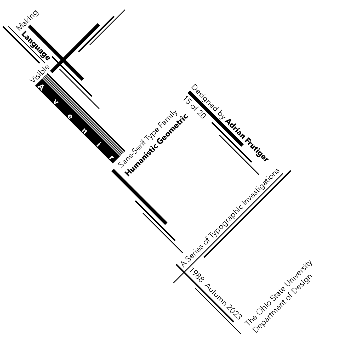
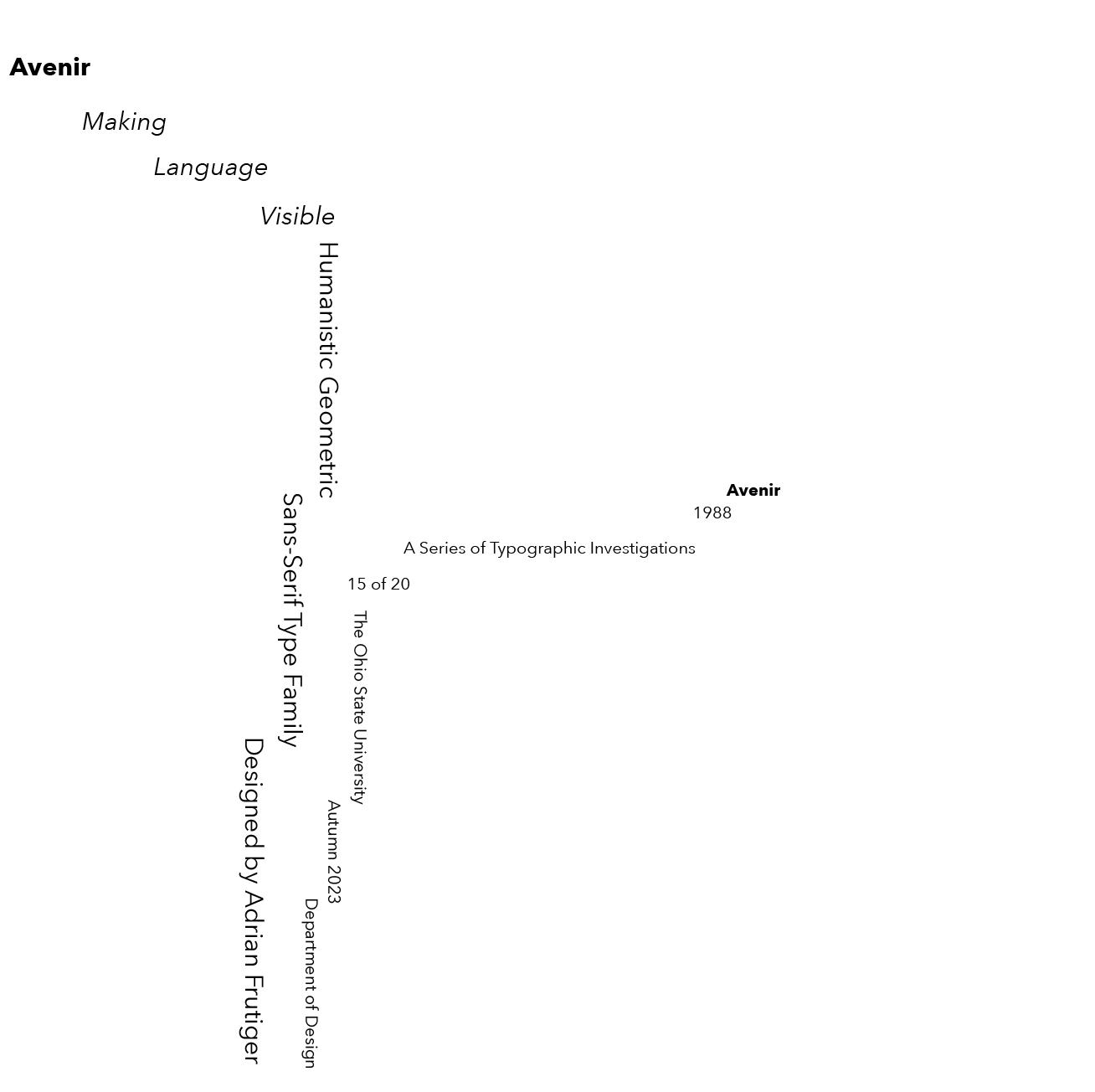
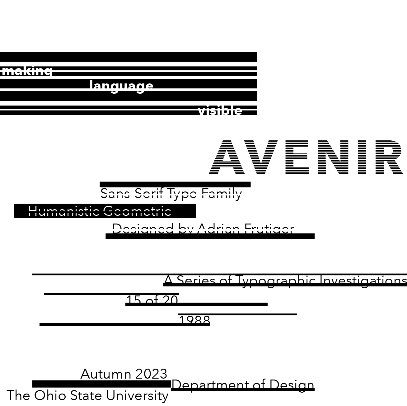
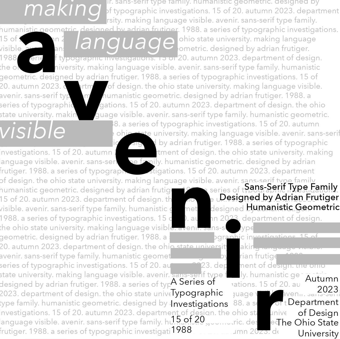
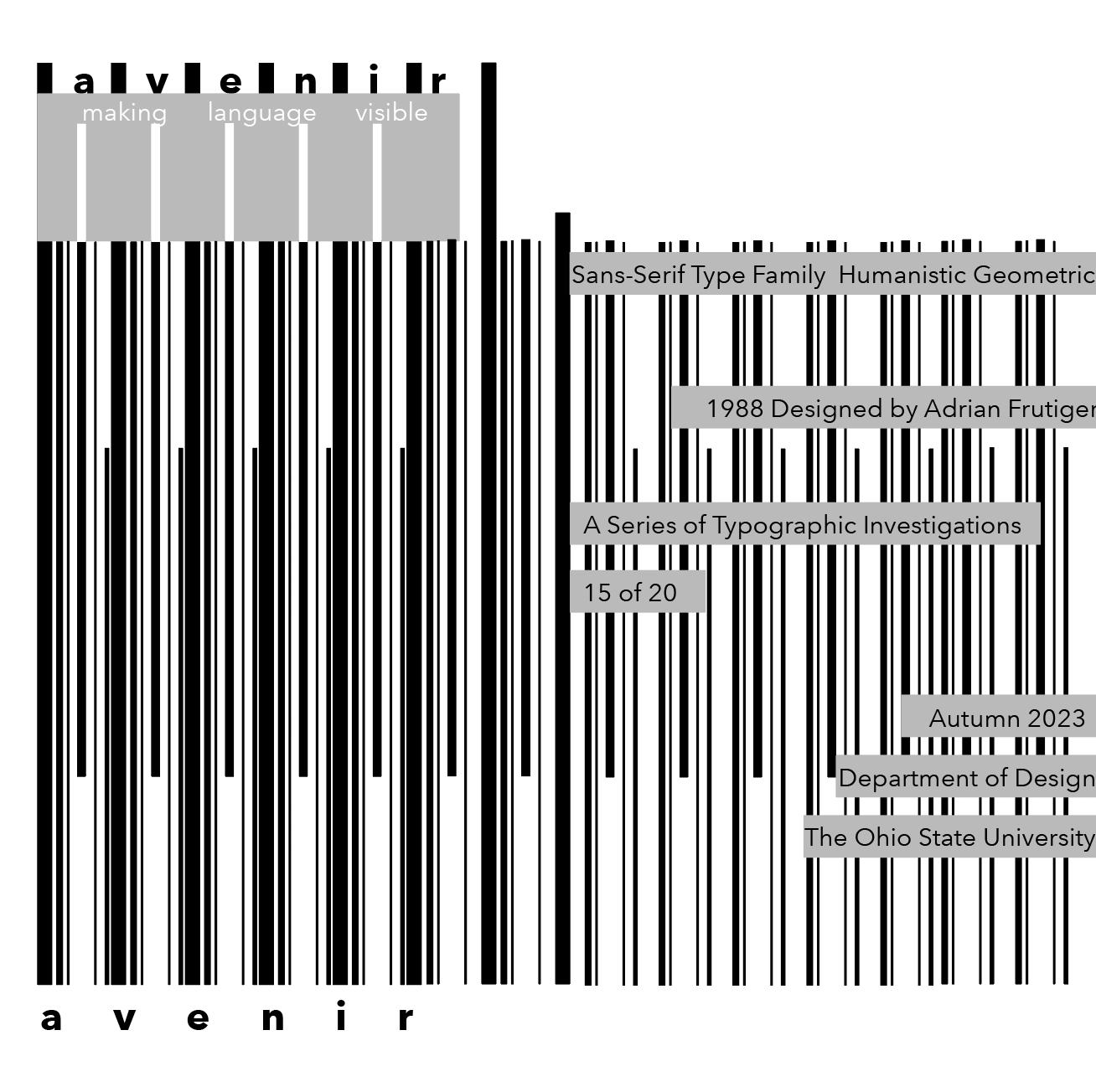
Some of my favorite compositions from this semester's guidelines. I was assigned the Avenir typeface designed by Adrian Frutiger, that I would be required to work with over the semester. This humanistic geometric sans-serif was ideal for creating symmetrical and asymmetrical compositions due to the thicker strokes, range of weights, and shorter ascenders for legibility.